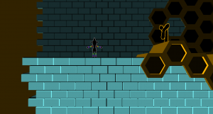
The entrance to the level. At this point in the game, you’ve just finished up the blue energy tavern, so you’re transitioning out of that color scheme.
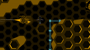
A one-way drop, and you pass the most basic enemy type of this area! These bees spin in a circle, but it’s safe to pass through the middle, as you’ll see when you fall down.
The level has blue piping throughout, both as a change in color and as a way of determining which way to go. The pipes will draw the player’s eye toward goals.

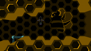
In comes the midboss! This was my key object. She’s got seven animations, and I’m planning on adding two or three more. Fully rigged, textured, all that. If I have time, I’d love to also make a health system and stick some hit boxes in there to make this a real fight.
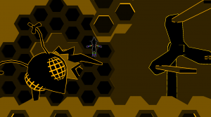
That windmill over there can be ridden to go to new heights! The boss of this area will be fought on a gigantic windmill (probably just a scaled up version of this one). Again, I already made the boss before the class started, so I’m not prioritizing anything involving him until all the new class content is done.
The final level is really long, and will take quite a while to finish putting together, so I focused on getting all the assets done and visible by the midterm. The level proper will be done in the next week or so.


The Hive-Queen model looks absolutely amazing!
For the level itself, I think if you brightened up the yellows in the hive-combs/walls and added a little more contrast, it would look really great.
I was really impressed with the level when you presented it in class. One thing I wanted to ask but never did; where did your inspiration come from for your main character?
I love the minimalism. It makes everything razor sharp and very readable.
Perhaps something to help breakup the simplicity would be good though. Those long stretches of honeycombs could be a bit of an eyesore, so maybe break it up with details inside the level- little scenes or extra props to give the level more life.