Critical Questions To Ask When Evaluating Design
"Clean" Design
- uncluttered
- simple - nothing unnecessary
- not too many colors or fonts
Harmony
- Do all elements seem to "belong" together? Do any seem awkward?
Hierarchy of Elements
- Can we visually see what is most/least important?
- Is it clear what we should look at 1st? 2nd? 3rd?
- Is the eye's path around the page clearly directed?
- Does the background compete with the foreground?
Form Supports Function
- Does the appearance agree with/support/complement the content?
- Does the style give the correct mood for the context?
- Do the colors and font choices have appopriate associations with the message?
- Do images and text go together?
Composition
- Is composition balances? If not, is it meaningfully unbalanced?
- Is the layout purposeful, or random?
Are elements aligned or clearly placed according to lines of continuation,
a grid, or in a balanced or proportional configuration?
Type
- Is type readable and does it flow clearly?
- Is there enough empty space around type (or other graphic elements)? Too
much space?
Color
- Do color choices go well together? Or if clashing colors are used, is it
for a purpose?
Meaning
- Is the message clearly understood?
- Is it correctly tailored to the appopriate audience?
Presentation
- Is it polished and professional with no glaring errors?
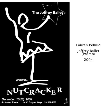
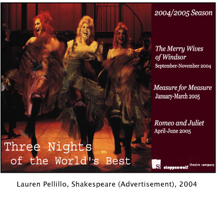
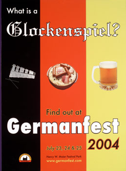
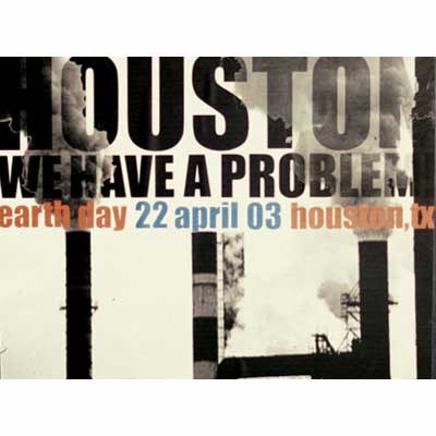
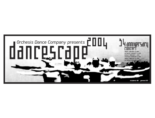
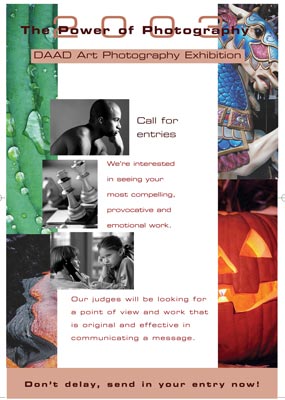
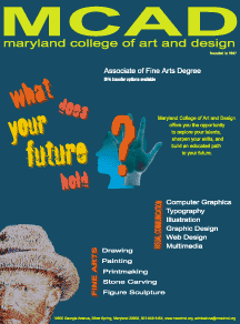
Student design examples for evaluation
