I chose a soccer theme when designing this project including an interactive soccer field connected to the MaKey MaKey, and 3 soccer based animations to attribute. My map has 3 points of interest, one point located on the corner of the field, one located roughly 20 “yards” away from the goal, and one off to the right in the middle of the field. The first two points activate animations based off of where the points are and what would happen in a game at those locations. The third point I simply used as a ground for easier access. I found my audio tracks from the class materials websites and edited everything using camtasia studio. Ba ba americano!
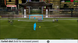
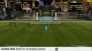
Creating the animations for this project was a tedious process in photoshop, recoloring every frame from scratch. I chose the method of uploading a video into photoshop from youtube and then creating a transparant video layer to sketch over the viedo with, creating my own simple animation. I found it to be much more time consuming than I thought, but worth it in the end. I uploaded clips from FIFA 13 and used those as models when creating my animations. Fun Fact: The person juggling is modeled after Neymar; the freekick was modeled after Ronaldo, and the corner kick was modeled after Rooney.


Really cool concept! My one comment would just be that your transition between your 3 separate animations felt very discontinuous. The default animation of the player juggling is really good, and the music fits well. It just feels very abrupt when switching to a different scene. I think this would actually be fine if you just kept the music playing while the scene switched. So even though the scenery was changing drastically, the music would keep it feeling continuous. (Love the music choice!)
Hey I like how you actually drew the soccer field on the paper!
I agree to what mcoryea14 says about the transitions. What I thought will work better is maybe instead of a juggling animations have the player do a dribbling animation so it seems more like he is playing the soccer game. Also, since the background of the other two animations are completely white, it may flow better if the juggling animation also had the same white background. Good job getting the frames out of the video though!
I really liked the Idle state for your animation. The separate animations felt too abrupt. Did you consider putting in a green background like you have in the start animation? I believe that would have made it more continuous.
I really like the way you drew over the movement of videos. It works really well for what you’re trying to do. Even with minimal detail, the movement is very fluid and readable.
Like I said in class, the initial animation reminds me of the iPod commercials that Apple put out a while ago. You did a great job tracing the video