While working on different assignments for our IMGD 300X course, I’ve been reminded several times about a game from Terry Cavanagh.

The game is called Super Hexagon. Here is a trailer for it:

The basic idea of this game is that your are controlling the small triangle in the middle of the screen with arrow keys (hold left to move counter-clockwise and the right arrow to move clockwise).

If  you get hit by any of the incoming ‘walls’ you die and you have to start all over again from the beginning. For new players this is incredibly difficult and they die in approximately 5 seconds (without exaggeration).

At 10 seconds you get to “Line”, 15 seconds is “Triangle”, 30 seconds is “Square”, 45 seconds is “Pentagon”, and 60 seconds is “Hexagon”. So once you get to Hexagon, you have beaten that level.

There are 6 levels in Super Hexagon, their difficulties range from “Hard” to “Hardestestest”–this is suggesting how hard this game is.

What I thought was very interesting about this work was that although the artwork in this game is all just geometric shapes, it is very addicting and many people I have talked to who plays this game really is into it. As we have done with the geometric abstraction assignment, I felt more confident that an artwork does not necessarily have to be so complicated having realistic objects (for example, 3D art in FPS games). Things could be really interesting with only simple geometric shapes, depending on how the composition is or how the objects are oriented. The hardest difficulty of this game only uses black and white objects!

Another reason why I think this artwork is successful is from the music that goes with the game. The music is done by Chipzel, otherwise known as Niamh Houston, and you can preview the 3 songs used in Super Hexagon at the site http://chipzelmusic.bandcamp.com/album/super-hexagon-ep. Looking at her profile you will notice that her music are made from the sounds taken by the Gameboy, which is why it sounds sort of 8 bit. The simplicity of the geometric shapes, how simple the actual game play is, and the 8 bit music brings the whole game together as if it were a single art piece. In a way, this game could be comparable to the original NES games like mario. The sprites are primitive and the music is 8 bit.

For those of you who want to see the actual combination of the three songs with the corresponding levels, I will post some links to each of the levels:

Hexagon

Hexagoner

Hexagonest

*Each level has a corresponding Hyper mode level, which is basically a faster version of it. Hence there are 6 levels (as a Hexagon has 6 sides!).

From looking at these videos you may notice that not only do the music differ, the types of patterns that appear in each level and the colors used in each level are different, giving each level a different atmosphere. I thought this was really good because to me it felt that the difficulty of the level corresponded to how intense/crazy the music was.

The patterns moving inward and the pulsing overall also gives the player almost a hypnotizing effect, as well as the repetitive music, making you feel like you are high on drugs once you play enough times. I played this game too many times on the iPhone that I beat the entire game, but I still happen to play it once in a while.

The techniques used in this work may be extended to many different interfaces of media. In a way, the recent “flat designs” used in the Windows 8 or iOS 7 is similar in that they make the icons simpler on purpose to give an interesting effect. Things do not need to be complicated or realistic to be interesting. Since I am not an artist and more of a programmer, I would like to be able to make games like this that do not necessarily need sophisticated art assets to be an interesting art work.

So, I guess you are quite interested in this game now. Here is a link to the flash version of “Hexagon”, a simpler version of Super Hexagon that could be played for free on the web browser: http://terrycavanaghgames.com/hexagon/

Can you beat my score?

hexagon

What’s up guys,

For the interactive drawing project, I decided to make a paper phone. When the user presses on one of the penciled-in apps, PD will play an animation that would correlate with the app pressed. Each alligator clip is connected to its own app, each controlling the d-pad on the MaKey MaKey, while the ground is connected to aluminum foil that runs around the entire “phone” to act as a ground when the user holds the drawing.

When designing the look of the phone, I was going for a cross between iOS, Android, and Windows, with a really clean and simple interface. This interface is a concept of a possible lock screen that would allow the user to quickly access their favorite apps without having to unlock their phone, similar to lock screen widgets.

Here’s a quick overview of the patch; each of the encapsulated patches for the apps are similar to each other.

PD Patch


Overall, making this project come to life was pretty fun! I hope you enjoyed it.

– Dan

Hey Guys!

So last week our assignment was to create an interactive drawing using the MakeyMakeys and Pd. When we were first assigned the project I struggled with coming up with a theme. Professor had suggested to us that our hand drawing be some type of map or story line so I decided I wanted my animation to tell a story.

My drawing portrays the familiar fairy tale. The prince is at the bottom of this path that leads to the princess’ castle. During his journey up the mountain he collects objects that will help him defeat the dragon and awaken his princess. My drawing has four triggers; the tree, the boulder, the castle doors, and the princess’ towers.

My home screen is an animation of the princess sleeping and her counting sheep in her dream. I traced a picture I found on google and added the sheep animation in PhotoShop. I got the sound off of free sounds. This animation is my favorite. I spent a lot of time on it and I am very satisfied with it.

When you touch the tree an animation of a horse appears on the screen. Using PhotoShop, I traced over a video I found on youtube of a horse on his hind legs. In Pd I inserted a sound file I got off of free sounds.

When you touch the boulder an animation of a sword being pulled out of the stone plays. I used a scene from a Disney movie as my inspiration. The sound was also found on free sounds.

The castle doors trigger an animation of a fire breathing dragon. This is the last animation before the prince reaches the princess. By this point he has collected a horse and sword. He is ready to slay the dragon.

The final animation plays when you touch the princess’ towers. This animation is a lot more simple and just symbolizes that they kissed. In the end the prince and his princess live happily ever after. Enjoy!

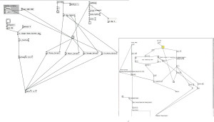
Sorry the Pd patches are so blurry!


Here is my Makey Makey Interactive Drawing. As you will be able to see. My map is of a beach scene. There are 3 components. A lighthouse, pelican, and fishing boat. The latter two when touched invoke an animation relating to what you see on the map. The lighthouse is the default animation that pops up when neither of the other two are playing. I had an idea for this scene before I started the project  but I did sketch out the map before I began making any of the animations. I used a video from Youtube to sketch over and create the animation of the diving bird but I did draw in the scenery myself. I also used Youtube for the light emanating from the lighthouse but drew in the landscape. Hope you enjoy!


Hey,

So for my interactive drawing, I chose to create a season changing animation following a leaf through each scene. I was going for a very zen/peaceful experience from the viewer. I believe I succeeded in making this effect. The animation itself was fairly easy to create. I hand drew the leaf in flash then exported it as a png sequence. This came out of the process with the wrong format and numbering sequence, so I brought it into photoshop where I rendered the video with the proper settings. I then painted over a forest scene to create one basic background of just trees to keep that a constant in the animation. I made 3 layers of it and painted each season. I imported those pictures into flash again and made them move with tween frames and did the same process I did for the leaf to create the image sequence.  I struggled with the pd patch a little to get it to do what I wanted. The logic was in place some times but didn’t do what the code said which was weird. This is the end patch:

Patch


So this week in Inter-Media Electronic Arts we got to play with the MaKey MaKey. At first, I was worried that the MaKey MaKey would be similar to the Arduino,  which required an understanding of circuits and some general ECE concepts (scary!), but it was actually wonderful to work with.  The way the MaKey MaKey works, is that it is simply an additional “keyboard” and inputs to the Makey Makey are just interpreted as keystrokes on a keyboard.  Then you use conductive materials and alligator clips to make different objects act as input devices with the Makey Makey.

Here is an example from Makey Makey’s site of what type of objects you can use with the Makey Makey.

(Image from http://www.makeymakey.com/)

The artist here used alligator clips to attach bananas (which are conductive) to the MaKey MaKey. The artist then either wrote, or opened a piano-playing application on the computer.  By hooking up the bananas to whatever keys played the different notes on the piano in the applications, the user could “play the bananas” like she was “playing a piano.”  It’s actually really simple, but really neat!

So our task this week was to use the MaKey MaKey (hooked up to our own drawing) and a set of our own animations to create some art.

That was a pretty open ended assignment, so everyone created something quite different from each other.  I decided to pick up where I left off last week, by starting with my interactive animation and enhancing it.

For the project there were a few requirements. There had to be sound in our project, and we had to create a pencil drawing or “map” that would control our animations.  Starting with my interactive animation from last week, I got rid of the other two animations and stuck with the Pikachu animation. Then I enhanced the Pikachu animation by adding more parts to it. In PureData I added sound for Pikachu coming out of the Pokeball and for Pikachu summoning the thunder.  I also added a sound that played on default while the application was running.

I chose sounds for my project that were from the original Pokemon games.  I thought these were fun, fitting, and nostalgic for many WPI students.  Once I got the clips, I trimmed and edited them appropriately in Corel Video Editor until they sounded like continuous loops.  The “Pikachu” sound and the thunder crash aren’t loops, because they only play as the lightning is crashing down.

For my “map” that would control my animations, my goal was to make it artistic.  The drawing that was the controller for the MaKey MaKey was supposed to be as interesting and beautiful as the animations themselves.  I drew my animation so that it was a sequence: a closed Pokeball, a Pikachu, and an open Pokeball.  The idea is that you first open the Pokeball to let Pikachu out.  That is why it starts as closed.  Then you call on Pikachu to use Thunder.  This is why you tap Pikachu as the second step.  And last, the Pokeball is open, meaning Pikachu is still outside it.  So tapping the open Pokeball returns Pikachu to it, and the animation sequence ends where it started: with a closed Pokeball.


I made a video of all this below, and I explain a bit of what I did while I demonstrate the MaKey MaKey attached to my drawing working together with my PD patch with my animations.

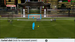
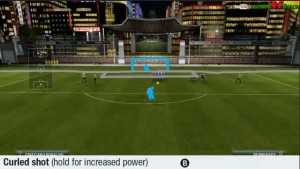
I chose a soccer theme when designing this project including an interactive soccer field connected to the MaKey MaKey, and 3 soccer based animations to attribute. My map has 3 points of interest, one point located on the corner of the field, one located roughly 20 “yards” away from the goal, and one off to the right in the middle of the field. The first two points activate animations based off of where the points are and what would happen in a game at those locations. The third point I simply used as a ground for easier access. I found my audio tracks from the class materials websites and edited everything using camtasia studio. Ba ba americano!

Creating the animations for this project was a tedious process in photoshop, recoloring every frame from scratch. I chose the method of uploading a video into photoshop from youtube and then creating a transparant video layer to sketch over the viedo with, creating my own simple animation. I found it to be much more time consuming than I thought, but worth it in the end. I uploaded clips from FIFA 13 and used those as models when creating my animations. Fun Fact: The person juggling is modeled after Neymar; the freekick was modeled after Ronaldo, and the corner kick was modeled after Rooney.


FK

FK2

Hello again. So I just finished my first Project right now, had a lot of difficulty on some parts but I think I managed to get it working.

First, as I am not particularly an artist, I decided to get some assets and edit them in photoshop for this project. I got the character assets from this site:

http://www.spriters-resource.com/snes/supermariobros3/sheet/4296/

this person made a sheet for Mario animation.

mariosprites

Yes, I am trying to make Mario. This will be fun…

Next I got the sound files from youtube:

Classic VGM 100: Super Mario Bros. – Overworld (Main Theme)

Super Mario Bros. 3 Sound Effects

and used Audacity to extract the parts I actually needed.

audacity

After all the Photoshop-ing I am ready to work on the actual coding.

sprites

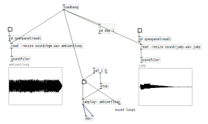
On load of the patch, I have a loadbang that creates the window, preload/downloads the images, and loads the sounds. Here is what the loadbang for sound looks like:

loadsound

You can see that I used relative paths for both of them. This is to make sure the files could be loaded even when the folder is copied to a different computer. Also, loadbang automatically starts and loops the ambient loop, but does not start the jump sound because the jump sound should only play once when the player presses the jump button.

Now, let us look at the jump portion of my code:

jump

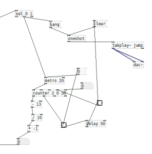
At the top, I have a sel object. When the player presses the jump button, a toggle will turn 1. So using the sel object, I can bang only when the player presses the button. Since I only want the jump sound play once for every jump, I have a oneshot object to ensure it only plays once. The counter at the middle starts from 0 goes up to 30 and down back to 0. This value is used to change the y position of the character up and down, as if it were jumping. Once the value goes back down to zero, I send a bang to the clear object at the top which resets the oneshot object so that it could play the jump sound once again.

I wanted the character to have its moving animation whenever the player holds down left or right. This was one of the parts that was slightly challenging because for our previous assignment we only learned how to do oneshot animations and looping animations, not animations that move on keydown and stop on keyup. Here is a small portion of my code:

toggle

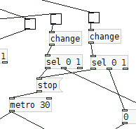
This code is where I am getting toggles from keypresses of the left and right arrow keys. Whenever they get a 1, they start the metro which is used for starting the animation and for moving the character position either left or right. From some google-ing I figured that I could just stop the metro at any point using the stop object, so whenever the sel is equal to 0 I decided I would send a stop to the metro. This worked fine.

At this point I only had 1 background with the character moving back and forth through the screen. This was fine, but I wanted the background to change once in a while. Here is how I did it:

backswitch

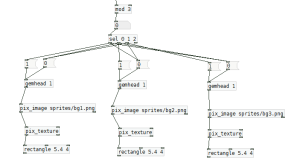
When going off screen either left or right, I kept track of the number of times the player did that. From that value, I used the mod object so that a number between 0 and 2 gets output. Finally, I used a sel object to hide/unhide the corresponding background image (here I have 3, hence I used mod 3). Going right I basically kept adding to the sum, and going left I subtracted from the sum value.

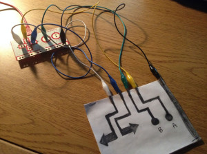
Once all of this is done, making the controller is quite easy. Four buttons and an “Earth” and done!

IMG_0615

And here is the demo video of the actual thing:

Thanks for reading!

Hey guys,

So for my first two assignments with animating in pd, I made an abstract cow and coffee. The first assignment was a challenge because I had to make the cow out of primitive shapes and position them in their own gemheads so I could move them independently. I had to figure out how gemheads work.

The second assignment went fairly well. I made all the assets in photoshop and laid them all out on on gemhead. I had difficulty similar to what happened in class, but I was able to figure it all out later on. I am quite proud of what I was able to create.