The inspiration for ./MALL 3015 came after a trip to the mall (I originally went to see Interstellar – a great film and potential classic). While looking at clothes, I though how wonderful it would be to just download a new look on your computer and have it be reflected on your body, without having to leave the house. The technology isn’t ready for a full implementation, so I explored how a UI would look for such a tool.
A critical element to the program is the folder structure for the images. The images are loaded with absolute paths
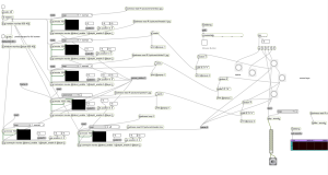
The main Max file is quite a mess. The images and loading video are loaded onto corner pin objects to be mapped onto the projector. The MaKey MaKey interface is connected to sub patchers that choose the image and to a sound object.
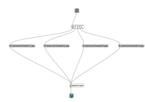
The sub patcher generates a random number from 0 to 3, scales it to 1 to 4. The number is then selected and the associated image is loaded.
The entire composition is projected onto a retro themed computer interface.


I am curious as to why you chose the interface that you did. Was there a reasoning behind having the “icons” of the clothing item be what you were interacting with as well as the location that the image was being projected? Was this design meant to simulate a touch screen? Or was the decision more arbitrary?
I enjoyed the interface you built around the mall board itself – mainly the loading bar and the animations, along with the sounds. It creates a nice contrast between a futuristic approach to art and clothing and the retro dial-up connection and internet.
The idea is cool, but I would also like to know why the projected images had to be over the material on the board. I was admittedly far away during my viewing, but the images were hard to make out on the wood board. Just moving the images above or below the board would feel cleaner, unless the images are supposed look directly on top of the aluminum(?) cut-outs.
Projection Art.
The fact that you used a projector is absolutely great. This is my completely biased opinion, but I have been impressed by projection art. I’d love to see more of it in class!
If you are interested in the subject matter check out this page:
http://www.byobworldwide.com/
While the board idea was great and over all it looked cool, I think it would have been better to use to board as a walk around sort of pad to control it since it was a little abstract as far as actually contributing to the visuals.