Noted in the video was a movieTexture that stopped working, which can be seen in its functional state here:
Web player below. Continue reading Lucid Final
Noted in the video was a movieTexture that stopped working, which can be seen in its functional state here:
Web player below. Continue reading Lucid Final
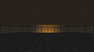
Tainted Temple takes place in a mountain top temple, recently abandoned by its inhabitants. You are an exorcist, coming to investigate possibly supernatural causes, rumored from those before, and eliminate them.
Of course as it is there is no combat simply because I have no idea how to do that.
I must say I am quite proud of my level, though it is lacking in propper clutter, or at least not as much as I would like. At the very least Igot the roof looking more complete than it had been, though its hardly optimized, and positioning each individual piece was a pain, and for some reason things were on odd slight angles now and then.
Overall, proud of what i have done as it is my first time working with the unity engine, though If I could go back I would definitely try to change my scope a bit, and focus more on one part, probably the caves, making a larger underground system instead.
The roof is my favorite. Feel free to stare at it and ignore other aspects.
Unfortunately the lighting did not work well, as it baked a shadow over the entirity of the building model, making them look not quite like I would have liked
The grass looks good at least. as gar as I think anyway, tough perhaps I should have thickened it up on the hill
The baking also made the interior lighting rather flat, and I wasn’t sure how to fix that either.
I touched uo the cave wals a bit, but I probably should have increased the torch lighting to show off the contours.
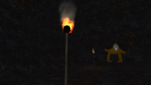
Torches were fun. Particles were a pain to adjust to something I liked. But the bamboo shafts turned out rather well, even though I accidentally made them blac and white at one point and had to re paint them.
Okay, this is about as “fixed” as the player controller is gonna get without a total rewrite. I got the bullets and IK working, but in order to have the player character register that he’s moving around and play his animations accordingly, I’d have to reprogram the controller from the ground up. (The current controller can also go off the edge of the stage, which isn’t intended.)
This is already technically late, so I’d rather just cut my losses and say “he has animations, don’t worry about it.” Aside from adding more fans (which were already a finished prefab), every change in this version is exclusively tech side- getting bullets to work properly, mostly.
Anyway! I’m really happy with how the final project came out. Give it a shot! (Try shooting at the enemies!)
Hey there, so I just finished my game. It is a game set on a tropical island, and you are a pirate searching for all the treasure chests.
The lighting inside of the saloon is completely off. I’m not sure why; it looks perfect in Unity. If anyone has a suggestion on how I can fix this, please let me know!
Besides that, here’s my final.
Kill the captain in the volcano with a cannon you find on top of the mountain.
I uh- I kind of exploded the character controller six ways to Sunday in the last couple hours.
Otherwise it’s good!! But I’ll have a more final version up later tonight.
Final build for my survival horror themed level.
Screenshots on my blog! Click here!
Here’s my final! It’s a bright and colorful day at the market!
Biggest regret is that I wasn’t able to rig my little pigs and have them run around in the mud… Will probably add that at a later time. :]
Since third person cameras are kind of difficult to program, I just put my character in the scene with a demo of her walk and idle animations.
Overall I’m pretty happy with it! This was my first time putting something together entirely on my own in Unity, so the struggle was very real. Will definitely need to tweak some of the textures and colliders when I have a bit more time. Right now there isn’t a collider on the stairs so you can’t actually get up to the roof, but that’s something I has originally planned to add. I’ll throw in a couple screenshots of that in a later post.
My final project- Rainy Day. I like how it came out, but if I went back and redid it I’d change a lot of things. I love the general feel of the level- my musician did a great job. The atmosphere I think flows really well, especially with the cars and windowlights. If I were to go back and rebuild from the ground up, I’d definitely redo the character mesh and make him playable. I’d mess around with particles too- I couldn’t get the rain to look quite how I wanted. All across the board I’d amp up the resolution on the textures, or at least make them geometry based for those sharp edges.
I learned a ton about unity, though, and that’s pretty cool.
Here’s the final submission for Sour Sewer. There ‘s a few audio hiccups as well as some weird alpha drawing bug I couldn’t figure out, but besides that everything should run smoothly.
I’ll discuss whatever issues there seems to be in class.
Threw some of my trees and bushes in a scene quickly to see the effect. I’m going for a super stylized and colorful feel. I’m also going to be adding a wooden fence around the area, and a few little farm animals (I’ve already modeled a little pig, but haven’t thrown a texture on him yet).
Are the colors too much? I’m having some difficulty making the path colors less jarring. I think I might just need to add in more slight color variations of the browns….