Final Project – Isaac

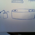
My final project started out with a brainstorming session. I wanted to integrate sound and visuals and looked though the list of arduino addons. My original idea was to have a virtual keyboard in PureData and integrate it with spraypaint, so that as the user was playing music, each note would cause paint to spray onto a spinning sheet creating a visual counterpart to the piece. The plan was to have servos attached to arms that would trigger cans of spraypaint. However the Achilles heel of the project was that I underestimated the force that would be required to spray the can. More Tommorow.

Here is the finished product:


I had to scrap the spray can idea because the servos couldnt handle it, however I did adapt the project slightly to include qtips that were dabbed in paint in place of the spray. The pure data portion worked out pretty well because I found some nice keyboard samples online to use.  One thing I was especially pleased with was how the arduino was able to provide both input and output.  Overall despite a few bumps the final project turned out better than I expected.


-Isaac

Meme Remix Project

For this project I continued on material we started in class and created a program in which a user can use an xbox controller to play videos, and crossfade between them, as well as trigger audio clips. I took some of the most well known songs that have become memes (such as Rick Astleys – Never Gonna Give You Up) and seperated the audio from the video so that users could see what it would be like if their favorite song suddenly had a new music video. This has yeilded some pretty interesting results. Video will be posted as soon as I can figure out how to incorporate the sound.

EDIT: Here is the final version, all transitions and sounds are being played via controller. Please excuse the crappy remixing, I can barely keep on beat when im awake let alone at 3am. Also sound does not come in until about 1.05.
enjoy:)

Inspiration

The work I chose is called Walk the Solar System by Louise O’Connor (2010) The project is listed as a performance, but it is also presented as a series of photographs. The artist calculated how far along in a neighborhood each planet would be, if the scale of the solar system was reduced. Whichever buisiness or shop was at that point, was asked to produce a round object representative of the planet that would be at that point.
I think one of the most successful aspects of this piece is that it deals with an often misunderstood concept and presents it in a very understandable way. The scale of the solar system isnt something most people can easily imagine so presenting it in such a simple and clever way is a great idea. Another thing thats done well is the way the planets are represented. By making the person who just happens to be at that spot, produce the object, rather than say having objects created by the artist, the work has a much more humanistic element to it. It also proves again the arguement “art does not exist in a vacuum” as the “viewer” must go to each location to experience the object there rather than sit in a museum absorbing information.
I think the work is perfect as it is. However to expand I would suggest to the artist, doing a series of these “performances”, going around to different neighborhoods around the world, and doing the same thing, and presenting the work as a collection.
Overall I think this is a unique and interesting piece, that many people would enjoy.

See the link below, for pictures, and information.

http://www.moma.org/interactives/exhibitions/2011/talktome/objects/146228/

Nature vs. Machine Sketch 2

My second sketch characterizes the darker side of the Nature/Machine interaction. We see a clear blue sky, but whenever we interact with it (read as: mouse over it) a black stain starts to appear. This is the inevitability of destruction. Could this be smoke in our atmosphere? Possibly. What happens when you click? what about when you hold the cursor still and click? Does it get better or worse….

Nature vs. Machine Sketch 1

For the first iteration of my project I went with the theme of a black hole. My original idea was to make a blue earth however I stumbled upon the idea of a black hole when I added some code from the book, that made a matrix of clouds, and made my “earth” shape black. The background color is also random because although black is more like space it gets boring.

Click to expand the black hole, and ask yourself: is it actually black?