Final project audio and video

I got everything I originally planned on making into my game, and made a bunch of audio, but could not get the into my program. The makey makey worked relatively well and I am still happy with the finished project. I tried several ways to put audio into my videos but ProTools stopped working in the lab. I checked on three different computers. I then borrowed somone’s window machine and attempted to use Window’s Movie Maker. It could not read my .wav files. I have a video of the gameplay and the physical input and another of just the gameplay. Even without sound the project was a lot of work, and took about 1000 lines of code, and a lot of tweaking.

Here is the finished game, though it will be less intuitive without the makeymakey. The dice and wires on the makeymakey were color coated to match the stats they increase. as of now arms/attack = left arrow, tails/defense = right arrow, head/magic resistance = down arrow, eyes (makes the enimy more likely to be something you are good againsts) = up, wings/evade = w, legs/speed = space bar. These were chosen to go along with what is accessible on the makey makey. If I used WASDF the wires would be too close and would press each other.

Here is some audio I made that I intended to use

Final Project Post 5 – Monster art finished on processing

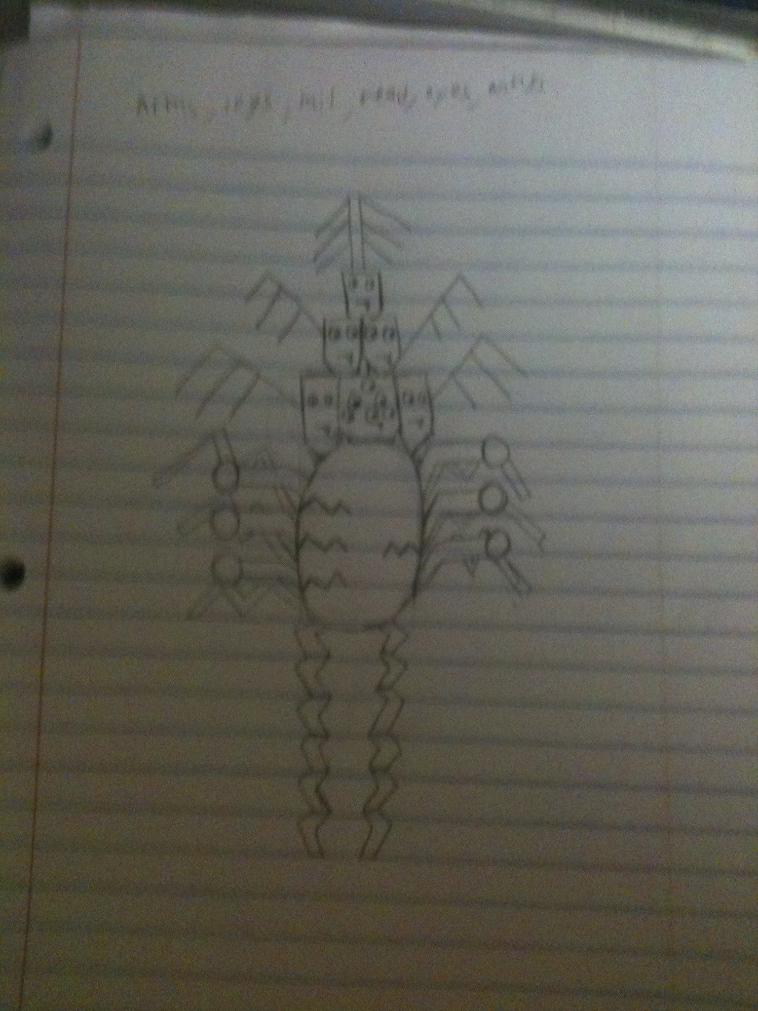
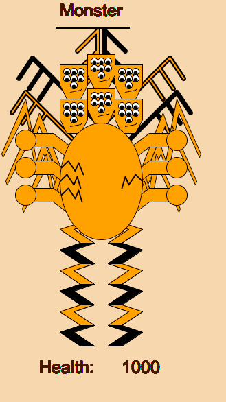
The monster is fully made. I do not yet limit the amount of total limbs you can choose so you can add up to 5 more of each part onto the base monster. This is a picture of him with all parts filled in:
monster
I do not have any game components in but the art aspects are basically done. I think I will add background music and maybe sound effects though. I may add a few other things if there is time but for now I will likely move to the game components. My script is below feel free to add parts to the monster. Tap 1 through 6 to add parts. 1 = arms 2=legs 3 = tails 4 = heads 5 = eyes 6 = wings. The keys used will change when the makey makey is added in. Also I thought it looked cool to alternate coloring for the legs and wings. I tried this effect in a few other places and it looked too busy. I like how it came out with the coloring differences just on those two.

On a random note my program is exactly 777 lines long at this point. Just thought that was funny.

Final Project post 4- enemies coming along

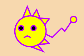
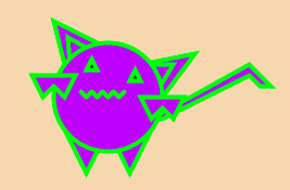
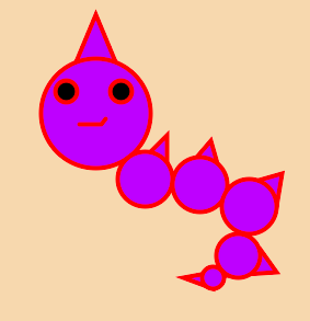
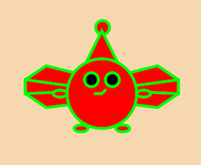
I finished actually making one of the enimies in processing. I took a screenshot of it in a sample color scheme. I will post screen shots of each of the enemy types to this page as I finish them. When all 4 are done I will post the script so you can see all color variations.

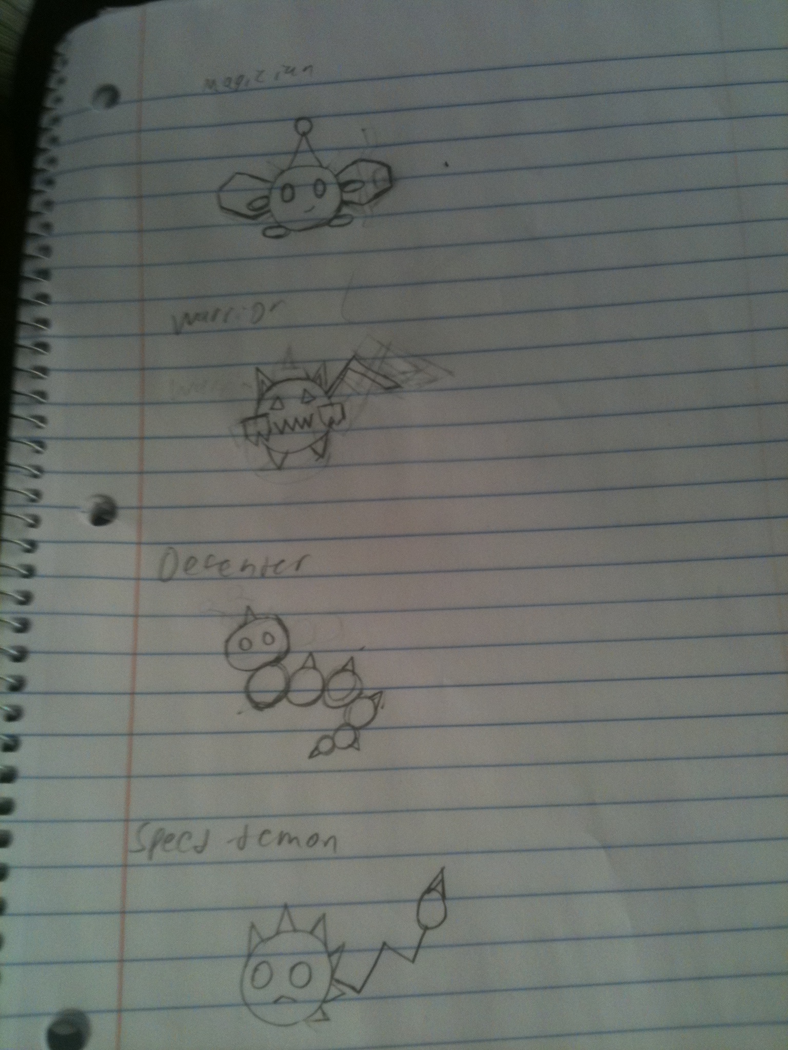
Speed-demon: This is a magical blocking speed-demon

Warrior: This is a quick casting warrior

Defender: This is an aggressive casting defender

Wizard: This is a quick striking wizard

Here is the current script, press space bar to cycle through enemies!

Final Project Post 3- more artistic

I’ve been told I’ll need to make my creatures more artistic. This may be tricky but I’m going to try. I don’t know how good this will look in final implementation but here are some designs I came up with.

These are the enemy shapes based on their high level stat. The fill and stroke will still be based on secondary stats:
4 enimy shapes

This is the monster if all parts were added. Note that the monster before anything is added will have a body, 1 head, 1 arm, 2 legs (legs just get longer), 1 tail, 1 eye, and 1 wing (note this will be the right wing at the top, so there will be a long line sticking out of the monsters head at the beginning. I know it’s silly but it was the best way to make things fit for all combinations. The monster as a whole is silly so it’s not too out of place):
Monster with all possible additions

I had the enemies randomly being created using the simple shapes. ALl of their stats are determined but not directly shown to the player. I have them printing to the console though and they seem to be generating correctly. The fill, stroke, and naming will not change so I might as well post this to give an idea. Press space to generate a new enemy:

Final project post 2: user interface layout

I went ahead and actually created the layout that will be displayed. I made some slight changes from my paper version. The dice roll display has been moved to the right portion of the area next to the stat section. It will always display the last roll you made and will say “please roll” when it is time for you to roll. This currently doesn’t do anything but I wanted to share my progress and show the current design. Unlike the paper one this allows you to see my color scheme. I thought the different shades of brown and tan would be representative of roleplay and adventure possibly because it makes me think of old maps and scrolls. I could be wrong but that was the color scheme I found fitting. I also colored the stat labels with the respective colors I’m using to represent them. If the monster has that stat than that will be the same color used to represent their primary stat. That could also be useful in helping the player remember the color correspondence when looking at the enemy. All of the numbers currently displayed are variables and could easily be changed to whatever is needed. On an unrelated note, I now have my makey makey!
Here is the layout made in processing:

Makey Makey project! Evolving creature dice art/game

My project will involve the use of a makey makey and a set of D-6 dice. It will be artistic in that it will involve evolution and change based on decisions you make, but will also be fairly game-like due to the fact that your input devices are dice. You start with a simple monster drawn in processing that has a head, a body, two arms, two short legs, a tail and single floating wing above its head. The head has 2 eyes and a mouth. The body parts are all simple shapes. You have 15 possible rounds. At the beginning of the round you grab a die to indicate that you want to roll to add to the stat that the given die represents. On screen you will see what you rolled and 1 + your roll will be added to that stat for your creature. One difficulty will be figuring out what stage of a given round you should be in and having the game stay in that state until the correct input/actions have been done. I like programming though so that should be manageable. Visually your monster will have a body part added to it based on the stat you added. If your creature runs out of health in a battle you will get the message: evolution failed, but see what you created! If you survived you will get the message: your creature survived look at your evolved magical being.
Your monster will have a set amount of health that does not change with its evolutions. Here are the things you can add to:
Arm = attack
Head = magic resist
Wing = evade
Tail = defense
Leg = speed
Eye = increase the chance that your enemy’s low stat will be something desirable. If you have low speed it’s low stat would be more likely to be speed. Similarly low attack makes it more likely to have low defense, low magic resist makes it more likely to have low magic, low defense makes it likely to have low attack. If your lowest stat is evade I will look at your second lowest.

The enemies will have speed, defense, attack, and magic. They will have one stat that that is high, two that are medium and 1 that is low. The high, med, and low will be a different range of possible random values, and the actual stats are randomly generated within that range. The number indicating the round we are will be added to the given stat so the enemies get harder over time. The enemies will be drawn to indicate what their high and medium stats are. The high will be indicated by their shape, one medium will be indicated by their color, and the other medium will be indicated by the stroke color. They also will have a name displayed that will be changed to indicate their high and medium stats.
Speed = green or circle
Defense = yellow or triangle
Attack = red or square
Magic = purple or star
Their name will be an adjective based on a medium, a verb based on the other medium, and noun based on their high stat.
Here is each stat’s low medium and high descriptors
Speed: quick running speed-demon
Defense: hardy blocking defender
Attack: aggressive striking warrior
Magic: magical casting wizard
So if the enemy has stats such that: magic > defense > speed > attack
Then it will be called a quick blocking wizard and would be a yellow star with a red stroke.
The enemy will have HP based on the round number and its defense. Attacks are not animated or anything but I will display the results of an attack. A round continues until either the monster or an enemy is out of HP. The monster and the enemy attack at the same time and the one with the higher speed has some chance at attacking a second time before the other gets to attack again. The chance is based on the difference between the two speeds. A single attack from an enemy gives two types of damage: attack and magic. The only difference is what your monster uses against it. Your monster will use defense and magic resist respectively. Some percent of damage will be subtracted from the respective area when calculated how many hit points your creature looses. Your creature only does attack damage, hence why the enemy has defense but not magic resistance. Evade is some percent chance of an attack missing your creature completely.

The reason for using dice: Even though this only involves a simulated roll, I still wanted to use dice. I find dice to be very fun and appealing objects and liked how they wil a factor in the random but still guided evolution of your creature. Some evolutionary attempts will work and some will not but you will get to see what your creature becomes, and due to random chance sometimes the same evolutionary path may not work even if it worked before or vice versa. That said I am fairly certain that some paths will be more useful than others. As for battling I wanted a reference to RPG type elements and some sort of nod to classic role-playing in a fun artistic way. That is another way the dice are represented in the artistic product.
Picture of your creature (if it had all parts, which would not be possible):
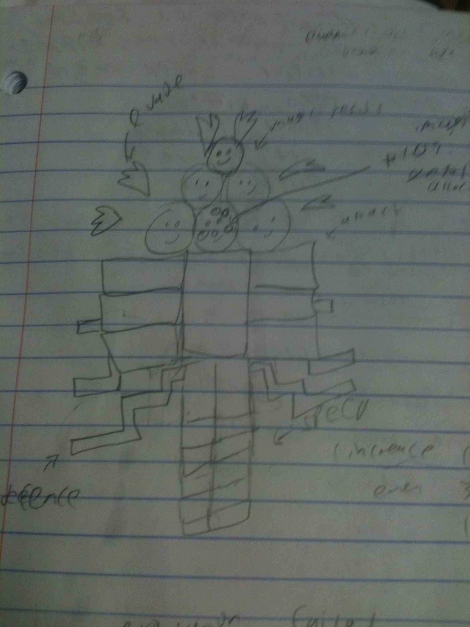
The monster
(^note the legs just get longer. Everything else adds more.)

possible on screen display:
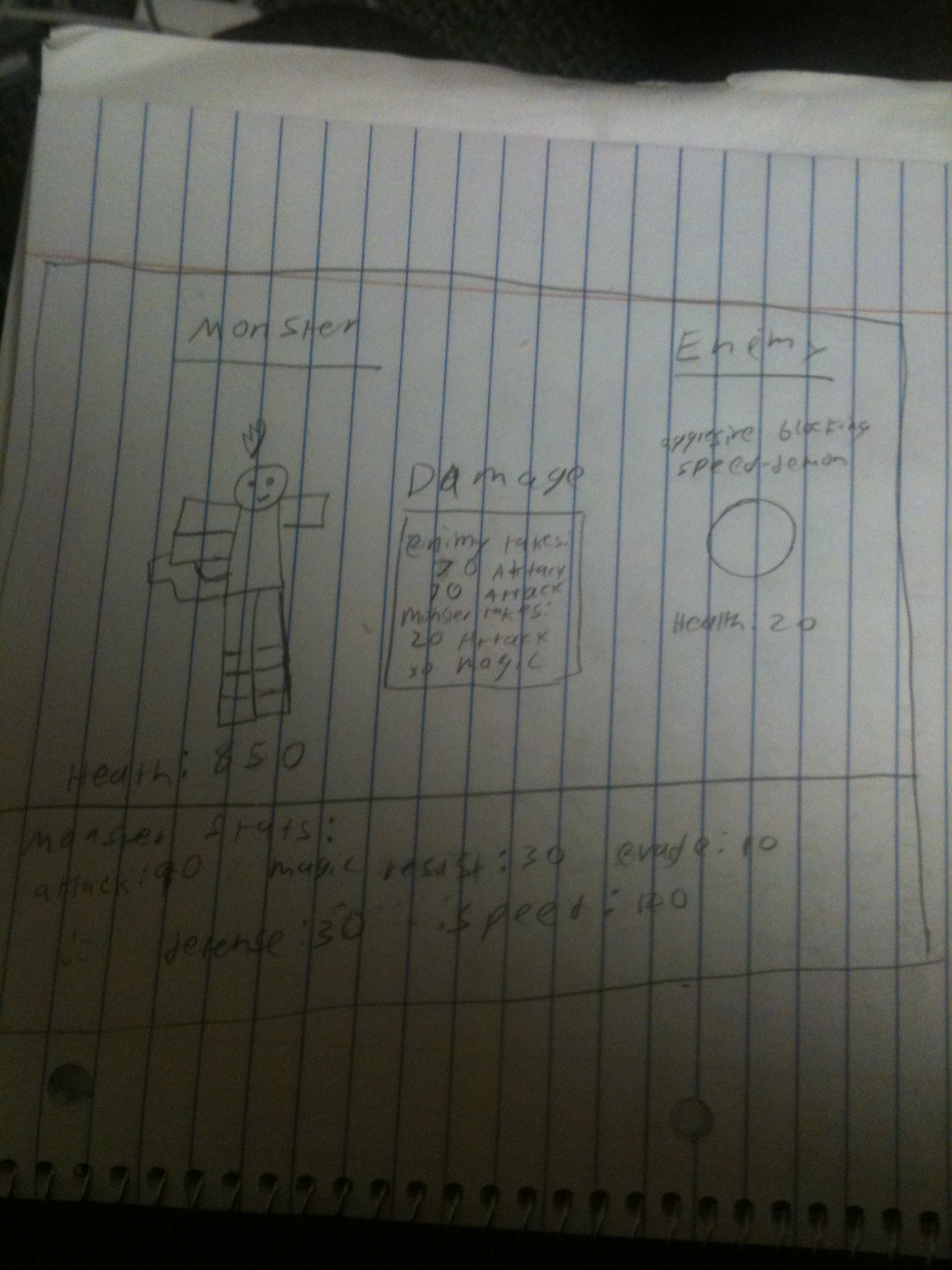
The UI

A few notes: Where it says damage during the battle it will say “Add stat” during the stat adding part, and will display the results of the roll. Also I do not know the exact numbers I will be using yet and will probably need some tweaking, but will worry about the mechanics first.

Meme video project-cats control the memebase.

My project involves the fact that cat videos have basically invaded youtube. You move around a cat paw with a controller. Even though you are controlling it the cat is “starting” cat related videos. It’s like the cats are taking over. If you start all of the videos the screen will fill with pawprints and you will get the message that cat videos and images are all over.

I put in audio, but the video playing is still being extremely glitchy. The paw moves using the D-pad input it gets from processing, and it starts a video if the paw overlaps where the video would be. If you stop moving after one starts it will continue, but if you keep moving around the videos tend to crash and glitch out eventually (often rather quickly). I tried many different things and could not get this fix. Audio has been added, and the audio of the latest video you started playing will play. For some reason when the videos load it plays a few seconds of audio from all the videos together. I could not get rid of this, but it is kind of an interesting introduction to the interactive that follows. If you move the paw to all the videos, a few seconds after the last starts (if it doesn’t freeze and throw a random exception by then) the screen will fill with cat paws giving the message that cat videos and images are everywhere. Cat2 contains the code without videos to show what the ending should look like. Cat4 has the audio and video but will likely freeze before the ending is reached. I could not get a video with sound because camtasia in the labs was throwing errors related to not being able to get the sound from my computer. I tried loading the XBox360 controller driver onto my machine so I could record it on my mac, but I could not get controller input to work on my computer.

Here is a video taken on my phone that shows me pressing the dpad on the XBox controller and the program running until a video crashes:
video1

Here is a video without the controller that shows the remainign two videos starting up:
video2

Here is a video of how the program should end, using the version I had before the cat videos were put in:
video3

Here is audio I put together to show an example of how it could have sounded:
audio

Interactive Art Inspiration – Alphabet synthesizer

While researching interactive art projects I found an interactive alphabet synthesis machine. The project is described on this site: http://www.flong.com/projects/alphabet/ The site also highlights other interactive art projects. According to this site “The products of the Alphabet Synthesis Machine probe the liminal territories between familiarity and chaos, language and gesture. ” I thought that quote was an interesting illustration of the artistic side of any alphabet. In my opinion an alphabet would have to be clear and recognizable as well as simple but varied from letter to letter.That said the alphabets made by this machine varied drastically in complexity and in shape. Some alphabets have extremely simple letters like this: simple alphabet and others are very complex like this: complex alphabet A large archive that shows sample letters from many alphabets can be found here: http://www.alphabetsynthesis.com/~flongco/alphabet/cgi-bin/archive.cgi?page=0 I feel that some alphabets work better than others. The machine itselef and farther description of the project can be found at this site: http://www.alphabetsynthesis.com/ I played with it myself and the machine has an interesting way of creating the alphabets. First the user writes a sample glyph that has some properties indicative of their language. Then the user gets a sample alphabet and gets to set various parameters than can click to evolve their alphabet. How it will evolve is not always obvious. Here is an image of the full alphabet I created using the machine. my generated alphabet I called kitsunen I now have it as a typeset that I can use in most programs.I really like the idea behind this project because it is very imaginative and could be used by people as part of other projects and creative endeavors. I think it succeeded in showing that alphabets can vary greatly. It also succeeded at mimicking characteristics that are familiar to us from other languages without directly copying them. That said I think they did a bit less well with the evolution portion of the interactive. I felt the controls were fairly unclear and it could have been more strait forward. Overall I still think the results were very interesting. As someone who likes videogames and role play games world building is very interesting to me. Having a made up alphabet is a good step in adding life to a made up culture. That said a person would likely want to vary the number of letters in the alphabet or maybe change the way they are used within the culture, but this gives someone a creative basis to start with. If this project is going to be extended maybe they could ask the user for input on how his/her culture would format their writing. Would it be left-to-right, right-to-left, top-to-bottom, diagonally, in square bunches, spiraling inward, scattered like a code, etc. It could then generate a simple sample correspondence from a “citizen” of that made up species. Another extension that would be useful could be the addition of numbers and special characters. They could also have some sort of dictionary where the user could store words he/she came up with for his/her civilization, and then after he/she have added a lot the program could sometimes suggest possible words based on the structures of the ones you have entered already. In general I like the idea of creative tools that helps with the world building process and allows for the development of further creative projects using your results.

Nature picture 3 – Caterpiller to buetterfly

After my last two images involved growth I thought I should find a way to include that theme with my last drawing as well. I decided this time to go with growing of a slightly different sort. The picture starts out with a little caterpillar on a dark background. Over time things begin to lighten up for the little caterpillar. It’s background becomes light green and it develops a cocoon around it’s caterpillar body. In the code the cocoon function still calls the caterpillar function as the original caterpiller still makes up part of the cocoon image. Later the background turns cyan as the bug grows wings and becomes a butterfly. In the image the cocoon becomes part of the wings. The butterfly function still calls cocoon and cocoon in turn calls caterpillar. The earlier portions of the image literally morph into portions of the new image. If you move the mouse around at any point all colored portions of the bug will change color or saturation based on the x and y coordinates of the mouse.

Edit: I don’t know why so many of my things don’t look right on the blog. For some reason the version here is not adapting to the mouse position even though every time I test it in processing it works for me. I don’t really know how to fix this.

Nature image 2 – growing trees

I liked the idea of using processing to make a tree with which the leaves branched greatly and were very sporadic. It represented nature in that it is not tamed or maintained in a neat orderly predictable way. I used noise in various places and a great number of random variables. I played around with a lot of different ways of drawing the leaves before getting the leaves to look a way I was satisfied with. After making the leaves, I decided to make the trunk in a similar way. I had lines of random shades of brown going down to somewhat random locations. The trunk was made entirely of these lines giving it an interesting grainy effect. The fact that the lines all come from a single center point make it seem like you are looking up at the tree and it makes the tree look very tall. After I made the first large tree I decided to make a second smaller one that grows after the first finishes. I likes the effect of having a large tree looking over a newer smaller one. I also played around with the background color but ultimately decided to use black due to the bright shades of green and the somewhat light brown trunk. I suggest watching through until the picture is finished but at any point you may click mouse to start over. Some times a trunk will look like two trunks and some times it will look like one based on the line placement. A trunk may also look full or somewhat broken to one side. The image should never look exactly the same twice.

EDIT: This looks different when I run it in processing on my computer. The center points of the leaves, and the points the trunks radiate from look different. These trunks look narrower than mine. The trunks here are always split as far as I can tell but on mine they are more commonly nearly full or at the very least much less split. It also looks sort of different in general to me. I apologize for this. I still like how the posted image looks but prefer my original.